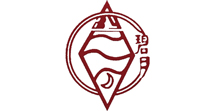
2022 is the 40th anniversary of Lianhua Technology. In the course of 40 years of development, Lianhua Technology has gradually realized that it needs a "symbol" to carry the initial intention of the enterprise, explain the significance of the enterprise's existence, convey its business culture and integrate its competitive advantages. So today, on the 40th anniversary of the founding of Lianhua Science and Technology, a new logo is launched, which is composed of blue "water drop" shape and red "hand" shape, meaning the guardian of China's water quality.

1982
2000
2017
From "Biyue" to "LH" is the business strategy
The brand logo, in the final analysis, serves the brand. Forty years ago, China's reform and opening up was just beginning. Driven by the market economy, enterprises sprang up like mushrooms. Even China Science and Technology was founded in 1982. In that era, the logo or trademark may only be a note of the significance of the existence of the enterprise, or a necessary condition for the operation of the enterprise, without so much consideration today.
The first brand and logo of Lianhua Technology, "Biyue Brand", was born. The word Biyue contains the unique poetic flavor of the intellectuals of that era, and reflects the simple patriotic feelings of the operators. Biyue Brand, carrying the memory of environmental protection workers in the 1980s, entered the millennium. As brand names and company names were isolated from each other, brands and enterprises could not resonate. Lianhua Technology ushered in the first logo change.
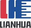
In order to connect brands and enterprises, facilitate large-scale business activities, and form a unified corporate cognition, "LH" came into being. After referring to the logo design of domestic and foreign enterprises, Lianhua Technology changed its brand logo for the second time, choosing the first letter of Lianhua Pinyin, an L and an H. As a high-tech enterprise, Lianhua Technology wants to integrate high-tech factors into the logo design, and selects the electronic chip as the element. The design of H is integrated into the pin of the chip. Since 2000, Lianhua Technology has officially launched the "LH" brand logo with red and blue colors. Red and blue have also become the brand colors of Lianhua Technology and have been used up to now.
The design of the brand logo should be epochal and durable, but if it cannot adapt to the development of the times, it will inevitably face the fate of elimination. In 2017, Lianhua Technology changed its brand logo for the third time, due to the fact that the second edition of "LH" did not do AI design, and could not meet the requirements of the specification in the fields of printing, review, publicity and other applications, and could not adapt to enterprise development and user needs in the Internet era. Therefore, when designing the logo of the third edition of Lianhua Technology, we did not use concrete elements, but paid more attention to corporate culture. Considering the water quality industry, we designed the "H" chip pin into a round corner shaped like a water drop. Lianhua Technology's thinking on the cultural connotation of the brand logo opened the prelude.


2017
2022
From "LH" to "Guardian" is a reflection of value
Whether a brand Logo is good or bad should not be judged simply by whether it is beautiful or trendy, but by whether it can well express the enterprise concept and the core value of the brand. At the 40th anniversary of Lianhua Technology, the brand logo was changed for the fourth time. The reason driving the redesign of Lianhua Science and Technology this time stems from the review and reflection on the business development of the enterprise over the past 40 years, which integrates the original intention, mission, culture and value of the enterprise into the brand logo, and points out the way for the business development of Lianhua Science and Technology.
In the past 40 years, it is not easy for a private enterprise to survive without deviating from its main business in one field by relying on one technology. No matter how difficult it is to survive or how prosperous it is, it must have experienced a lot. On the occasion of the 40th anniversary of Lianhua Science and Technology Co., Ltd., business operators have thought: What is the real significance of the existence of enterprises? For the country and society, for human beings, for the employees of the enterprise, what is the survival of the enterprise?
For the current Lianhua Technology, there are many meanings, such as improving the technical level of the water quality detection industry, improving the material well-being of employees, creating wealth to pay taxes for the country, and so on. However, how can these contents be expressed through a "symbol" and a brand logo? After reviewing and thinking about the founding of the enterprise, it is found that to solve this problem, we need to go back to the "origin", that is, what was the founder's "original intention" to develop this technology in that year?
After repeated inquiries and recollections of the founders of Lianhua Technology, the impression of that era gradually returned. An intellectual with a sense of family and country rode a broken bicycle every day with an aluminum lunch box tied to the handlebar. What he thought was very simple. The heart is to make sewage treatment more effective through its own little technological change. The bottom layer of its heart is essentially the "guard" of nature and human water sources. Aware of this, the brand logo of Lianhua Science and Technology has more cultural connotation requirements. Combined with the original intention of "guarding", it is rooted in the field of water quality testing, improves the material well-being of employees, and creates a new era demand for mutual benefit and win-win for Lianhua Science and Technology. On the 40th anniversary, the "guardian" logo was released, following the original intention of the enterprise, and is determined to guard China's water quality for the next 40 years!
Post time: Dec-21-2022


